Wood type, sorted by wear
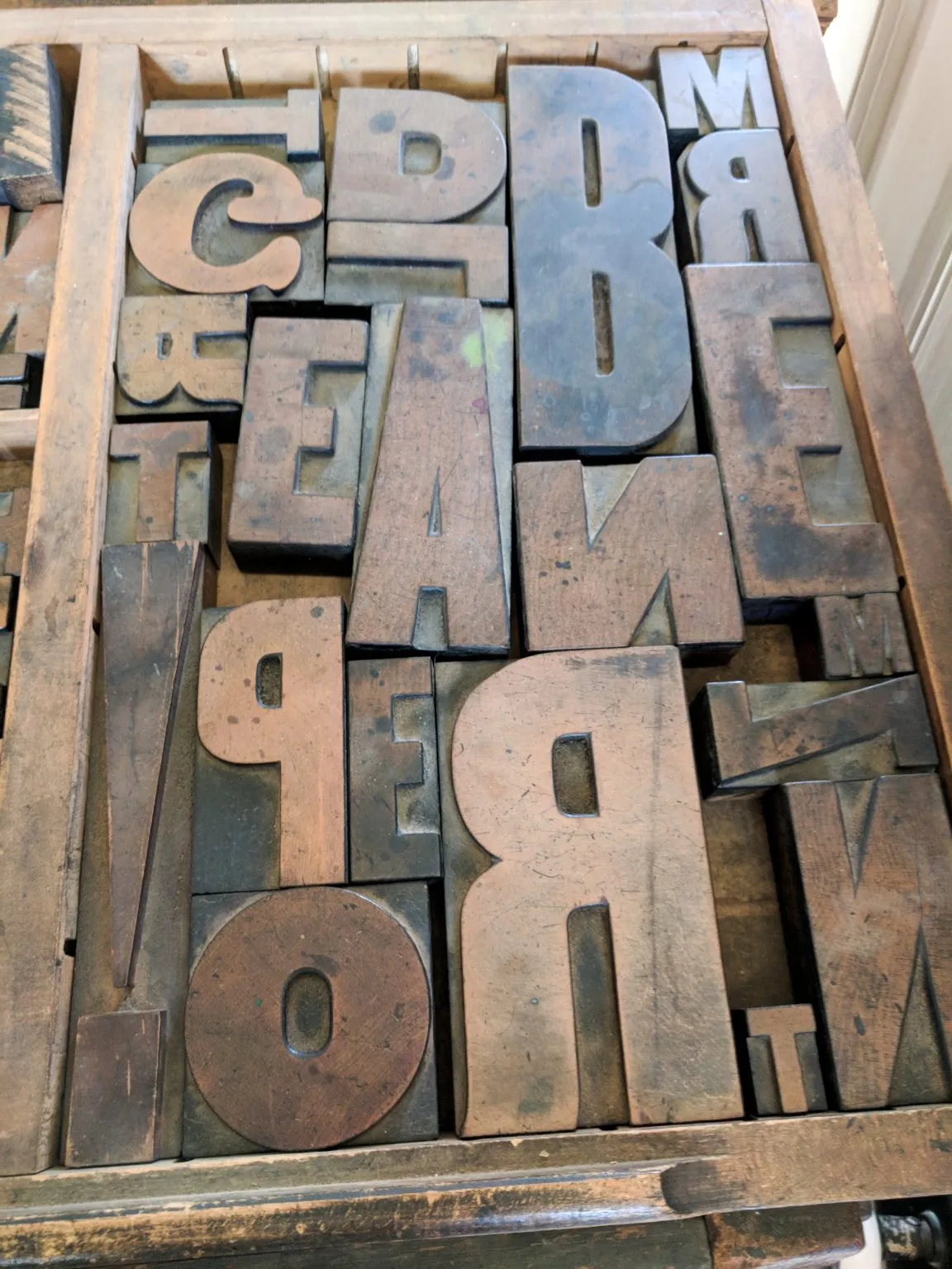
A tray of large wooden letters, read for what years of printing have done to their faces.
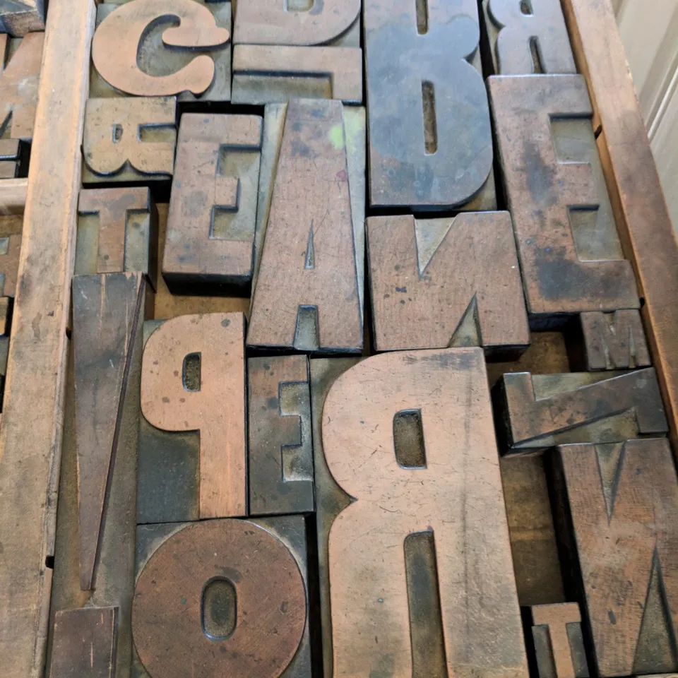
The tray holds a mixed fount: a heavy slab-serif D and R, condensed capitals, a lighter G, and a few small Ms and Ts tucked into the gaps. Nothing matches, and that is the useful part. Letters from different sets wear in different ways.
What the faces show
The darkest letters are the ones that were inked most. Their faces carry a sheen where ink has soaked into the end grain, and their edges are rounded rather than square. A paler letter beside them has barely printed, and its corners are still sharp.
Everything reads backwards. The R and the P face the wrong way, as they must to print the right way round, so the eye keeps catching on familiar shapes that are not quite right.
Type at three sizes
Specimen · Instrument Serif 400
Worn edges, soft ink
Headline · Instrument Serif italic
Worn edges, soft ink
Text · Jost 400, 18 / 1.6
Worn edges, soft ink. A letter that has printed for years loses its corners first, and its counters fill a little with every pass.
Colour taken forward
- Old ink
#2B2522 - Worn face
#8A5634 - Proof magenta
#B61460
Two colours read from the tray and one chosen for a first proof.
Colophon
| Object | Wood type in a shallow tray |
|---|---|
| Looked at | Wear on letter faces and edges |
| Taken forward | A type sample at three sizes and a proof colour |
| Sheet | Square |